
When RiskScape Strategies came to Fortify, they had been in business just over two years and were ready to update their brand to realign with their 5-year vision. They wanted a visual identity that felt both technological and premium. They had an existing logo, a node-based circuit mark inspired by motherboards, which symbolized a forensic consultant with digital investigative and loss quantification expertise. Rather than pushing for a redesign, the decision was to refine it, understand what made it work, and build outward from there.
The branding work moved forward with that foundation. Logo refinement, brand guidelines, templates, collateral. The system was coming together, and it was solid. As the work progressed, it became clear that the brand identity refresh could do more if it extended beyond static applications to their website where it could breathe.
The Fortify team showed RiskScape what that could look like, not as a sales pitch, but as part of a vision of the system at full scale. The owners understood it immediately and didn’t just accept the branding work, but asked us to build the website too. That’s the moment everything shifted.
Now came the real challenge. How do you actually combine technological sophistication with premium design without falling into the trap of visual noise? How do you make something feel innovative without making it feel busy? Most designers solve this by leaning heavily in one direction. Add enough tech elements and call it cutting-edge. Strip it down and call it luxury. But those are easy outs. The harder path is restraint.
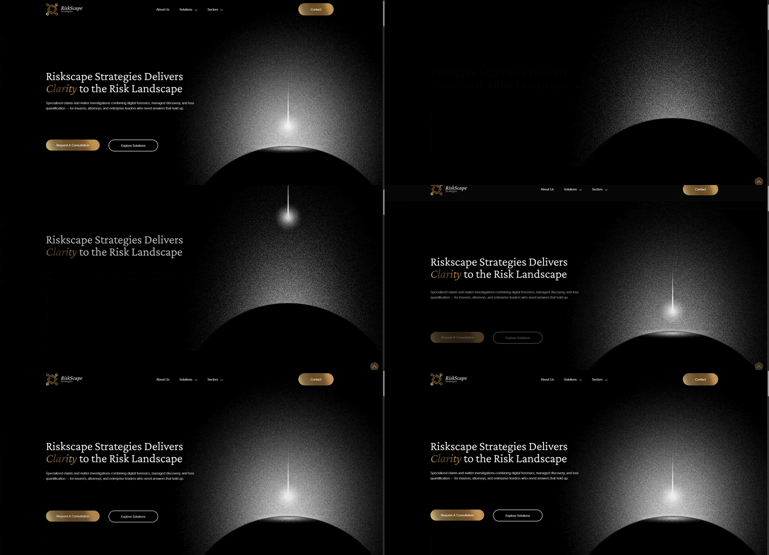
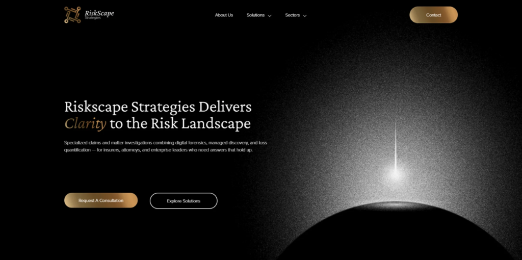
RiskScape had one image they kept coming back to during the design process. A falling star over a planet. That single image became the anchor for everything that followed. It became the hero section, the first visual cue that visitors could see. It’s not decoration. It’s the visual translation of RiskScape’s entire value proposition—bringing clarity to the risk landscape. That image shaped the entire brand direction. From that moment forward, every decision spiraled outward from that one concept.

A custom galaxy background rendered in RiskScape’s service colors and inspired by the Horse Nebula extends that vision across the entire site. The space is intentional. Research in UX design shows that whitespace and negative space reduce cognitive load, allowing users to absorb information more effectively. But beyond the research, the space itself reinforces the message. Expansive. Sophisticated. Intentional. The background isn’t just decoration. It’s part of the communication.
Read about the project further here: https://fortifyadv.com/portfolio/branding-website-conference-launch-for-risk-advisory-firm/

Gold accents appear throughout, but only at critical moments. CTAs, key terms, specific design moments. This restraint is what creates hierarchy. Color psychology research shows that when everything is highlighted, nothing stands out. The value comes from scarcity. Each gold element draws the eye because the rest of the interface respects the user’s attention.
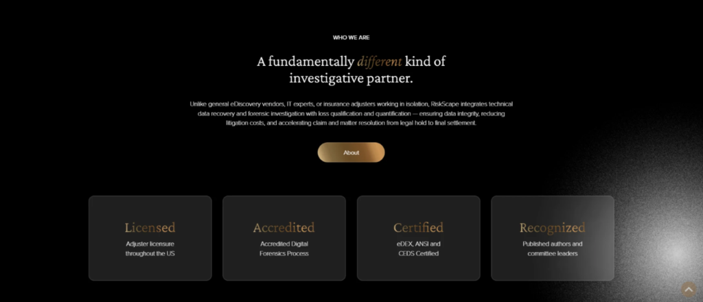
The card sections use translucent layering and glass morphism, a trend backed by measurable UX benefits. Studies show that layering and transparency help users understand information hierarchy faster. The cards float above the background, existing in conversation with the design rather than competing with it. The animated circuitry drifting behind sections keeps the technological theme present without overwhelming the layout.
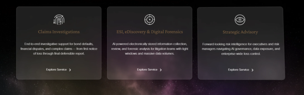
But where the design truly reveals its sophistication is in the small details that most users never consciously notice. These are the micro interactions. Hover over a card and a light follows your cursor movement. The card responds with a subtle swerve. This isn’t flashy. It’s considered. Research shows that small interactive moments reduce perceived load time and increase user trust. More importantly, they signal something. They tell users that someone thought about their experience at a granular level.
The buttons themselves shimmer on hover. The gradient shifts. They feel tactile and responsive. The principle here is affordance: an interface element should communicate how it’s meant to be used. These buttons don’t just look clickable. They feel like they want to be interacted with. They feel like pressing an elevator button in a five-star hotel. That attention to detail is what separates good design from premium design.

The overall goal of the website was singular: prove that a company operating in legal technology could present itself with sophistication and depth, not just cutting-edge visuals. RiskScape needed users to understand that behind the innovation is rigor. Behind the design is strategy. Every element serves the message. The website needed to communicate that this is a company run by people who care about precision, clarity, and expertise.
When the project shipped, it was clear that something worked. RiskScape had more than a brand system. They had a complete visual language that proved something specific: technological sophistication and premium design aren’t contradictions. They’re the result of disciplined thinking, where every choice earns its place and nothing is included just because it’s trendy.
That’s the moment that mattered. Not just delivering a website, but delivering proof of a principle. That attention to detail, that refusal to take shortcuts, that commitment to making every micro interaction meaningful. That’s what separates work that functions from work that actually says something about the company behind it. That’s what separates good design from design that matters.